Background
This is an implementation of the paper, “Message-based Community Detection on Twitter”, written by Carl Miller and associates at CASM Technology.
Partygate is a political scandal in the United Kingdom concerning gatherings that were attended by government and Conservative Party staff during 2020 and 2021 where COVID-19 public health restrictions prohibited most social gatherings. These gatherings sat outside of the restrictions.
Understandably this was a divisive issue and covered at length by the UK media. Opinion Polling suggests that partygate was an important factor in declining rates of public support for the Prime Minister, Boris Johnson, as well as for the Conservative Party more broadly.
Using Twitter’s Search and Stream API it was possible to collect a sizable database of tweets using the hashtag #partygate as well as the subsequent engagement. By analysing this data, we can better understand the nature of the accounts that were engaging with this hashtag, highlight any automated ‘bot’ or inauthentic activity and identify communities with similar thoughts and interpretations of the scandal.
Traditional network analysis would link entities based on follower activity and other engagement. This implementation links accounts based on the language each author uses leveraging state-of-the-art natural language models capable of creating mathematical representations of text. These linguistic representations can spatially express similarities between accounts allowing for the identification of communities which can then be characterised through a combination of quantitative and qualitative means. Traditional network analysis uses engagement to create edges between accounts and is a reflection of popularity on Twitter where communities form around influential accounts. Communities based on language are more likely to be inclusive of less popular accounts which is important when trying to understand issues such as politics or elections.
Data Collection
Gazouilloire is a command line tool for long-term tweet collection from Twitter’s Stream and Search APIs allowing for large datasets to be created. By running a local Elastic server Gazouilloire will start to build a database of tweets given specific keywords or search terms (lucene query syntax can be used for more complex queries).
Installation instructions can be found on the Github page, you just need to make sure that you have ElasticSearch installed and a working set of Twitter API keys (the Twitter developer account needs to have elevated access for Gazouilloire to work).
Tip: I was initially struggling with getting Gazouilloire to connect to Elastic, if you are experiencing similar problems it is probably to do with Elastic’s security settings. Gazouilloire works over HTTP by default while Elastic won’t accept a non-HTTPS post. Whilst not optimal from a security perspective; setting the xpack.security.whatever variables to False in your elastic.yaml file will fix this.
Once installed you can use gazou init to instantiate a project where a config.json file is created for your amendments. Editing the file to include your Twitter credentials, Elastic database details and keywords is all that is required before beginning to collect your data. I also changed the grab_conversations variable to True so that recursive retrieval of all tweets that engaged with the hashtag were also collected.
{
    "twitter": {
        "key": "xxxxxxxxxx",
        "secret": "xxxxxxxxxxxxxx",
        "oauth_token": "xxxxxxxxxxxxxx",
        "oauth_secret": "xxxxxxxxxxxxx"
    },
    "database": {
        "host": "localhost",
        "port": 9200,
        "db_name": "partygate_full",
        "multi_index": false,
        "nb_past_months": 0
    },
    "keywords": [
        "#partygate"
    ],

    "url_pieces": [],
    "time_limited_keywords": {},
    "language": null,
    "geolocation": "",
    "resolve_redirected_links": true,
    "resolving_delay": 30,
    "grab_conversations": true,
    "catchup_past_week": true,
    "download_media": {
        "photos": false,
        "videos": false,
        "animated_gifs": false,
        "media_directory": "media"
    },
    "timezone": "Europe/Paris",
    "verbose": false
}
Over the course of a day ~350k tweets were retrieved that mentioned, retweeted or engaged with a #partygate tweet from 102,000 individual accounts.
The python library eland is an Elastic client which was used to retrieve the list of unique users from the database
import eland as ed

ed_ecommerce = ed.DataFrame('http://localhost:9200', 'partygate_tweets')
usernames = ed_ecommerce['user_screen_name'].unique()
In order to map accounts on the basis of similarities in the textual content of their tweets it was important to analyse all of the account activity, not only when tweets referring to partygate were posted. Collecting the most recent 200 tweets from the timeline of the 102,000 distinct users resulted in a dataset of approximately 20,400,000 tweets.
Collection of the most recent 200 tweets from each users timeline was achieved by passing each username to the below function. A csv file was saved for each account. You will need to put in your own Twitter credentials and also import csv and import tweepy
def get_all_tweets(screen_name):

    #authorize twitter, initialize tweepy
    auth = tweepy.OAuthHandler(consumer_key, consumer_secret)
    auth.set_access_token(access_key, access_secret)
    api = tweepy.API(auth, wait_on_rate_limit=True)

    #initialize a list to hold all the tweepy tweets
    alltweets = []

    #make initial request for most recent tweets (200 is the maximum allowed count)
    new_tweets = api.user_timeline(screen_name = screen_name,count=200)

    #transform the tweepy tweets into a 2D array that will populate the csv
    outtweets = [[tweet.id_str, tweet.created_at, tweet.text] for tweet in new_tweets]

    #write the csv
    with open(f'new_{screen_name}_tweets.csv', 'w', encoding="utf-8") as f:
        writer = csv.writer(f)
        writer.writerow(["id","created_at","text"])
        writer.writerows(outtweets)
To have a more manageable dataset it was important to focus on the accounts which most intensively engaged with #partygate. Each of the ~102,000 accounts which had only mentioned or interacted with #partygate twice or less were removed resulting in a dataset of 1,226,500 tweets authored by 4,906 users.
Account Representation
As discussed, instead of a more traditional network map that groups accounts based on friend-follower relationships, we are instead mapping relationships based on the similarity of language used in the tweets that were posted or amplified. By retrieving the last 200 tweets from each account (not only those tweets mentioning #partygate) we can identify communities of accounts defined by common linguistic attributes. To do this, tweets are first mapped to a vector space using a pre-trained sentence encoder, in this case all-distilroberta-v1.
Future work: Arguably the most recent 200 tweets aren’t reflective of a complete activity timeline. The dataset could be enriched by incorporating a vector representation of the bio, geotagging information or use of object identification on the profile image.
For each account the transformer was leveraged to map each tweet into a 768-dimensional space and then an average was taken to get an account level representation. Given the number of calculations that were required, this part of the process was shortened by using cloud GPU servers with more memory than I had available on my laptop. I used a paperspace GPU+ instance which had 30GB RAM and a Quadro M4000 GPU.
The csv files which were created in the “Data Collection” phase above were placed into a “triagedcsv” folder and the below code was ran to get the account representation vectors (saved in the accountrepresentations.csv file).
from tqdm import tqdm
import os
import pandas as pd
from sentence_transformers import SentenceTransformer
import re
import string
import numpy as np

directory = 'triaged_csvs'
model = SentenceTransformer('sentence-transformers/all-distilroberta-v1')
user_account_representations = []

def remove_punct(text):
    text  = "".join([char for char in text if char not in string.punctuation])
    text = re.sub('[0-9]+', '', text)
    return text

for filename in tqdm(os.listdir(directory)):
    #print(filename)
    tempstring = filename.split('_tweets.csv')[0]
    username = tempstring.split('new_')[1]
    temp_df = pd.read_csv('triaged_csvs/' + filename)
    temp_df['clean_text'] = temp_df['text'].apply(lambda x: remove_punct(x))
    user_account_representations.append([username, np.array([model.encode(tweet) for tweet in temp_df['clean_text']]).mean(axis=0)])

df = pd.DataFrame(user_account_representations)
df.to_csv('account_representations.csv')
Account Network Construction
To construct a network diagram where each node is a Twitter account and weighted edges represent the similarity between two accounts, it was necessary to calculate the cosine similarity. Specifically, the weight of an edge between two accounts is the cosine similarity of the account-level representations (averaged message vectors) of the two accounts. This was also a computationally intensive step which benefitted from cloud computing. Given a pairwise calculation needed to be done across every account vector (an array of length 768), the below script took over 20 hours to complete.
import pandas as pd
import numpy as np
from numpy import dot
from numpy.linalg import norm
from tqdm import tqdm
import itertools
from numpy import dot
from numpy.linalg import norm

df = pd.read_csv('account_representations.csv')
df = df.dropna()

df.columns = ['index', 'username', 'vector']

def vectoriser(weird):
        one = weird.replace('[', '')
        two = one.replace(']', '')
        less_weird = np.fromstring(two, dtype=float, sep=' ')
        return less_weird

df['new'] = df['vector'].apply(lambda x: vectoriser(x))
df.drop('index', axis=1, inplace=True)
df.drop('vector', axis=1, inplace=True)
data = []

for tup in tqdm(list(itertools.combinations(df['username'].tolist(), 2))):
        x = df.loc[df.username == tup[0], 'new'].to_numpy()
        y = df.loc[df.username == tup[1], 'new'].to_numpy()
        result = dot(x[0], y[0])/(norm(x[0])*norm(y[0]))
        data.append([tup[0], tup[1], result])

df_final = pd.DataFrame(data)
df_final.to_csv('mappings.csv')
Displaying every edge in the chart would almost certainly be an indecipherable blob given that there would be 10’s of millions of edges so the dataset was reduced by setting a threshold to preserve the relationships between only the most similar nodes. Using only the most highly weighted 250,000 edges, 247 of the accounts were excluded from the network on the grounds that they were not sufficiently similar to any other account.
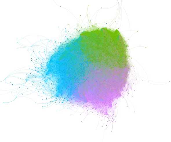
Gephi was used to graph the network. For positioning nodes, the ForceAtlas2 layout algorithm was applied which is a widely used approach to spatialise a weighted, undirected network in two dimensions. For community detection, Gephi uses the Louvain method, a modularity based algorithm, which assigns a single community to each node. Approximately 99% of accounts were assigned to one of 3 communities.
Community Characterisation
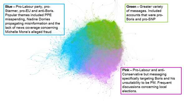
The next step in the process was to manually inspect accounts from each community to attempt to identify the attributes they had in common (Blue, Green and Pink). To manually characterise each community in this way, accounts were randomly selected from the core of each community (the core of a community was considered to be the dense region around the community’s ‘centre’), as suggested by the network’s spatial disposition. Between 50 - 150 messages from each account’s timeline were read to create a narrative summary of the content that the account had either originally authored or amplified.
Features analysed included:
- The profile picture of the account (especially the presence of motifs, tropes, regional or national identifiers);
- The profile description of the account (interests, hobbies, political or ideological attachments);
- The number of followers of the account;
- The number of accounts that the account follows;
- The number of tweets sent by the account;
- The retweet:tweet ratio of the account
The characterisation of each cluster below is interpretive in nature and therefore not only an expression of the data but also the judgements and biases of the analyst (me). The descriptions do not imply that every node within the community cluster displays the characteristics detailed and there will be significant ‘noise’, particularly at the edges of the clusters, where the node does not behave in the way that the cluster description would suggest.
Tip: Manual tweet analysis was conducted by one person in this investigation which increases the likelihood that author bias impacted the community characterisation. If you were looking to reduce the effects of analyst bias on your study then you should consider having multiple analysts review the tweets in isolation.
Blue Community Cluster
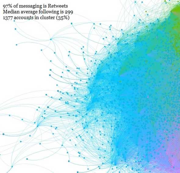
The Blue Community Cluster is indistinct from the larger central grouping on the chart, occupying ~35% of it. It is the sparsest of the clusters, with many accounts sitting away from the central grouping demonstrating a broader set of linguistic characteristics than the other clusters. The Blue and Pink Community Clusters share a lot of the same characteristics, namely; pro-Labour tweets, pro-EU tweets, pro-Keir Starmer tweets, anti-Conservative tweets and anti-Boris Johnson tweets. The Blue and Pink clusters differed on the themes that were amplified. Of note, was the amplification of tweets that highlighted Nadie Dorries’ propagation of disinformaton concerning Keir Starmer and the lack of coverage, particularly by the BBC, regarding the raid of Michelle Mone’s residence. Given the high volume of retweets in this cluster (97%) it is almost certain that this cluster has coalesced due to prominent tweets that were shared across many of the accounts. It is also probable that there was significant ‘bot’ activity occurring given the lack of original content and relatively low average following of accounts in this cluster.
Pink Community Cluster
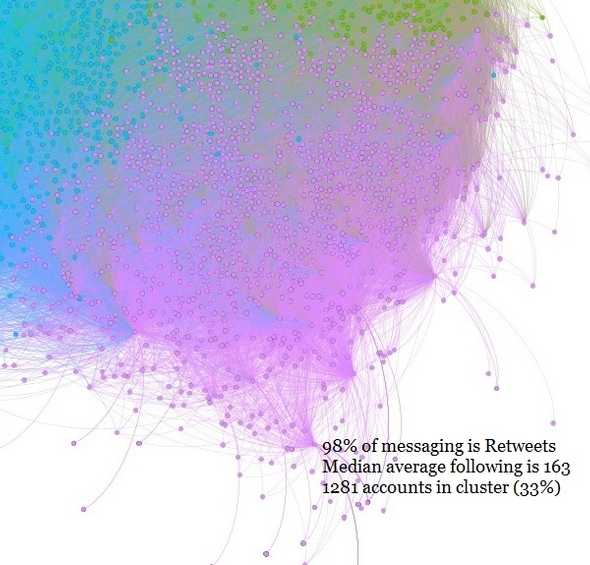
The Pink Community Cluster is indistinct from the larger central grouping on the chart, occupying ~33% of it. It has fewer outliers than the Blue cluster but is not as densely concentrated as the Green cluster. As mentioned, the Blue and Pink Community Clusters share many of the same characteristics, however, the Pink cluster had a greater volume of tweets that were specifically anti-Boris Johnson. In addition, the tweets analysed in this cluster discussed ongoing local elections (as of May 2022) and Boris Johnson’s unsuitability for the role of Prime Minister and as leader of the Conservative Party. Given the high volume of retweets in this cluster (98%) it is almost certain that this cluster has coalesced due to prominent tweets that were shared across many of the accounts. It is also probable that there was significant ‘bot’ activity occurring given the lack of original content and relatively low average following of accounts in this cluster.
Green Community Cluster
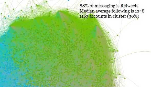
The Green Community Cluster is indistinct from the larger central grouping on the chart, occupying ~30% of it. It is the densest cluster with the fewest outliers suggesting that their is less variation from a linguistics perspective. Despite this, the Green Community Cluster was the only cluster where pro-Boris Johnson tweets (#BackBoris) and tweets supporting the Scottish National Party (and Scottish Independence) were observed alongside accounts with more traditionally liberal standpoints. The volume of retweets in this cluster (88%) is high but is notably different from the other clusters when considering the volume of original content. It is probable that there was significant ‘bot’ activity in this cluster although, given the relatively high median average of followers, it is a possible indication that there were fewer bots (or possibly a more mature approach to automated amplification).
Observations of Amplified Content
- An activity common across many of the accounts that were appraised was the very high quantities of retweets and few original messages. Because of this it is highly likely that prominent retweets would have had a strong effect on how the accounts were clustered compared to a situation with a greater selection of original content.
- The author of one of the top 10 most amplified tweets was also present in the network. Alastair Campbell’s (@campbellclaret) account was placed in the Blue cluster and his most prominent tweet across this time period was on the 19th April and shared over 7000 times.
- In the Pink cluster, 3 of the top 10 most retweeted posts were authored by Keir Starmer. Whilst not indicative, it is possible, given the relatively high percentage of retweets in this cluster that there was an orchestrated attempt at amplification using bots by supporters of the Labour leader. Further analysis of the accounts in the Pink cluster would need to be conducted to test this hypothesis. This analysis would likely include a temporal study to identify retweeting patterns and a dataset that extends beyond the most recent 200 tweets.
- Interestingly, the average age of the accounts across all the clusters was longer than two years which suggests a fairly mature approach to automated activity, assuming automated activity was prevalent. To achieve this, either aged accounts have been purchased or this is a network of accounts that has operated for many years.
- By volume, there were far more tweets suggesting that partygate was still a prominent issue and one that reflected poorly on Boris Johnson, his Government and the Conservative Party. Even in the Green Community Cluster, which contained accounts in favour of Boris Johnson, there was a large quantity of anti-Government tweets.
- Given the lack of original content and the probability of inauthentic and automated ‘bot’ activity, it is difficult to judge whether this is reflective of the UK population as a whole. An unintended output of the analysis may have been the identification of different automated influence campaigns. It is possible that the Pink cluster identified a network of bots promoting Keir Starmer content and highlighting Boris Johnson’s shortcomings with a view to influence Local Elections this week. The Blue cluster may have been a campaign with broader aims to undermine the Conservative Party. As above, analysis of temporal patterns and a separate dataset would be need to test these hypotheses.
Tip: Automatic detection of ‘bot’ activity is actually quite difficult. Even some published, scientific papers studying automated activity and disinformation have struggled identifying valuable heuristics to discriminate between human and non-human activity. One of the most common automatic bot detection tools, Botometer, has been increasingly criticised over the accuracy of its results.
Interpretation
The research of suspicious activity online, including suspected influence campaigns, frequently confronts a common problem: any number of different underlying motivations can manifest as the same behaviour. Inauthentic activity, organic engagement, automated activity and commercial motivations all mix together to drive online behaviour. Definitively distinguishing between all of these different forms of activity is extremely challenging. The nature of the activity often relies on the underlying intent and motivation of the actors involved and so is beyond the ability of research such as this, which is aimed at describing behaviours on an online platform.
Limitations and Caveats
As with any methodology, the approach used here carries with it a series of strengths and weaknesses. When interpreting the data, the following caveats should be regarded;
- The cluster descriptions are impressionistic. Other researchers may have drawn different contrasts or similarities from an appraisal of accounts in this network, or may have placed emphasis elsewhere.
- The cluster descriptions do not hold true for every account that is a member of them.
- Manual analysis, while the best method for developing holistic impressions, does limit the number of accounts that can be used to characterise clusters.
- Each cluster will contain ‘noise’ of different sorts; including accounts that are from different countries, use different languages and do not behave in the way that the overall descriptions of each cluster would suggest.

